Google's New Changes to Search Results Blur the Lines Between Organic and Paid Entries
Around a week ago you may have noticed changes in the layout of your Google Search results. I actually thought that I had done something wrong and spent a while trying to figure out where I had inadvertently triggered some kind of secret key combination setting. In surfing around for answers I discovered that in fact Google had updated the search engine to look quite different.
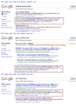
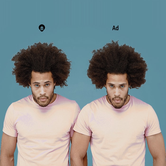
A great case in point is the below visual which shows a paid Apple entry on top of the official organic entry for the same. The structure of the content is identical with only the difference in the site icon [apple icon] and the two letter distinction [Ad] to distinguish between organic and augmented :
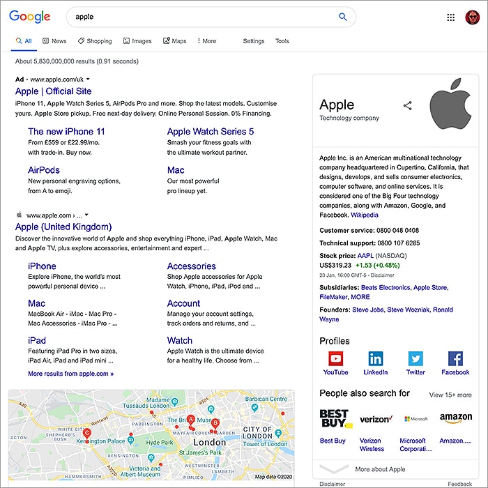
In the previous iteration the paid search results were structured differently and more overtly visually separated out from the organic results - and even included differences in link colours - green vs blue. Apple of course is billing this exercise as a streamlining and refinement of its search engine, but to the critics it seems a fairly obvious and blatant attempt to wholly blur the boundaries between the core organic results and Google's paid services. I'm pretty sure the various ombudsmen, consumer organisations, the EU etc. will step up to admonish Google - but this is indeed an interesting precursor to Google's recently announced gradual phasing out of 3rd party cookies.
I of course am an eternal cynic now and a rather detail-oriented individual at that - meaning that I have several active mental filters in place to screen out and identify surreptitious markers. I just won't click on any advertising content - certainly not banners. I just don't trust the format or the wider industry as it stands. Advertising should not be about exploiting the consumer with bluffs and deceits - it should be a valued-added exercise to alert and inform consumers to new and beneficial offerings in those areas they are interested in.
Actually, since I started composing this article - Apple seems to have changed tack again - dispensing with the website icon prefixes, and now solely punctuating the paid results alone with the [Ad] prefix in front of the first listed URL in that content segment.
The page structure is somewhat different for sure - and you do now sort of see the [Ad] content at the top of the page and the organic results further down - possibly that may satisfy the critics to a degree. There is no getting away from the fact though that there is very little now to distinguish between the paid and organic results - possibly the version without the icons is even worse - but that's not for me to say. User / Consumers just need be more aware of their environment and more careful how they go.
I personally am still not sure whether I prefer the new layout - for sure it looks neater to a degree - but I feel that some useful signposts/markers and tools may have been lost along the way.
Related
How does the new layout enhance user experience in search results?What benefits does the streamlined design offer to advertisers?How can consumers effectively identify paid versus organic results now?What impact might this change have on click-through rates for ads?How does the removal of icons affect user trust in search results?
Did you find this content useful?
Thank you for your input
Thank you for your feedback
Upcoming and Former Events
Affino Innovation Briefing 2025
Webinar - Affino Elevation Update Demo
Webinar - Introducing Affino's Fourth Generation AI Services
Webinar - Enhanced Affino Commerce & Subscription Capabilities
Meetings:
Google Meet and Zoom
Venue:
Soho House, Soho Works +
Registered Office:
55 Bathurst Mews
London, UK
W2 2SB
© Affino 2025
