Connect with Us!
A Short Treatise on the Affino Logo

Affino in name was born at the start of the year 2000. The platform it was made to represent started off a little earlier (1998) with a working name of ’Sunrise’. It was decided in 2000 to formalise ’Sunrise’ into a modular platform, whose main virtues were its comprehensiveness, interactivity and hands-on management and configuration abilities. You can read about the origins of Affino in my earlier blog post about its ’Pedigree and Provenance’.
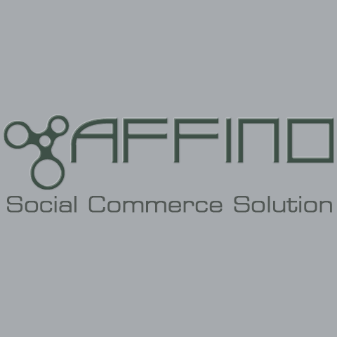
AFFINO is derived from the English word Affinity, which itself comes from the Latin Affinitas - meaning UNION, CONNECTION, RELATIONSHIP.
The logo consists of a symbol ident and a unique typeface which was designed as a companion to the then Affino brand owner - Emojo. Emojo would later transmogrify into the current Affino company, where the evolved logo now represents both company and solution / platform.
The Affino ident represents connectivity and evolution by way of 3 principal interconnecting circles, growing by increments on an anti-clockwise schema from smallest at top-right position to largest at base. The use of circles imbues the symbol with cyclical values, referring to the iterative and continually changing / progressive nature of both Affino and its environment.
The power of 3 / triptych has been used throughout Affino’s history to detail particular parts of its function or inherent benefits. In the very first version, Affino was packaged into 3 increasingly comprehensive solutions - INTRO, PROMO, SYNCRO - with INTRO being the entry-level offering, PROMO the intermediate version and SYNCRO the fully comprehensive version of the solution:
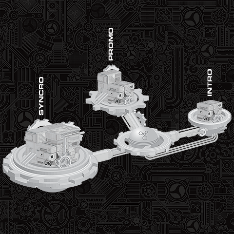
When Affino was first launched, it was billed as ’The Interactive CMS’. In those days all web management systems / platforms were associated with CMS; there was not really any scope or understanding for anything beyond the concept of CMS or Store (Ecommerce).
The first version of the logo was designed by Jason Webb, and featured a bright orange colour scheme to communicate user-friendliness and accessibility for something which was really quite complex in scope.
The 3 principal circles were initially filled-in with a dark blue - a good contrast to the orange, and evoking watery planet-like globes:
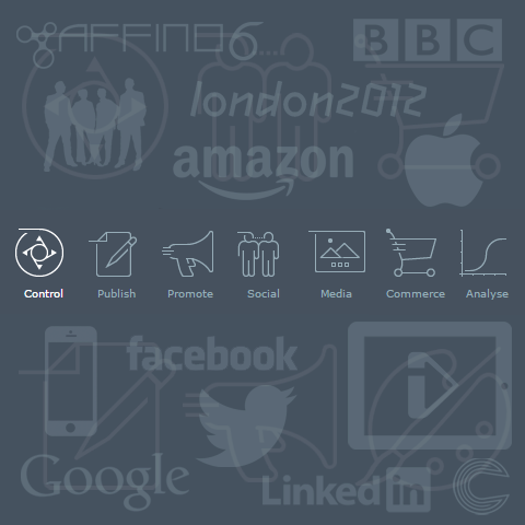
Later iterations / derivations of the logo included a number of mothership-like diaroma schemas which were used to represent Affino’s comprehensive nature by clustering / grouping relevant parts of the solution together. When Affino served BBC Worldwide / UK TV, a significant part of the solution was ’Net TV’ (TV on the Internet), which never really took off though and has since been deprecated.
Apart from Net TV, pretty much all the other functionality depicted has been retained and added to - Affino currently has numerous additional modules, including Funding, Recruitment and Collaboration.
In Affino’s second significant iteration, the solution was advertised as an ’eBusiness Suite’ - i.e. in contemporary parlance a digital business solution. We were trying to forge our own direction and coin a term for what we did; unfortunately the term ’eBusiness’ never really took off.
The following ’Mothership’ diorama is from circa 2007, and features all the Affino functionality available at that time, you can see that the positioning strapline is the eBusiness one:
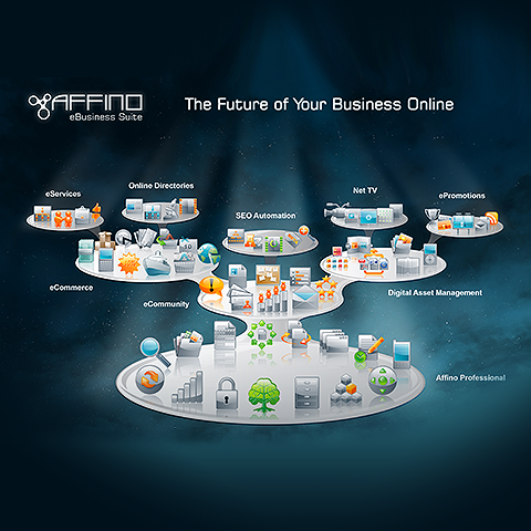
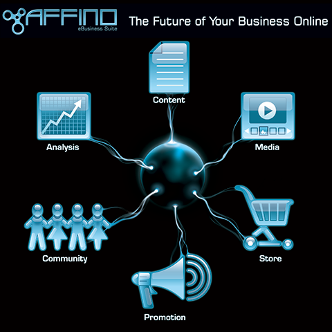
At around the same time, Affino was also being promoted as ’The Future of Your Business Online’ - that sentiment is little changed today, although the language and exact context used may vary.
Affino was represented by 6 principal parts then:
CONTENT + MEDIA + STORE + PROMOTION + COMMUNITY + ANALYSIS
The logo was used in a variety of different colour schemes and textures, as fit the needs of the time. The strapline also evolved away from eBusiness and on to ’Social Commerce Solution’. Our CEO Markus Karlsson was in fact the first to coin the phrase ’Social Commerce’ - meaning the unified combination of Community and Ecommerce. Social Commerce as a phrase though was soon hijacked to mean more of a social plugin rather than a fully integral offering which is what Affino was and still is.
AFFINO POSITIONAL STRAPLINES:
Affino 1-2, LX, NX : ’The Interactive CMS’
Affino 5-5.5 : ’eBusiness Suite’
Affino 6-7 : ’Social Commerce Solution’
Affino 7.5+ : ’Unified Digital Business Platform’
In 2012 it was decided that we should freshen up the Affino logo in line with the new Affino 7 release. The control-side interface was to go through a total re-design too.
2012 was of course the year that the Olympics came to London, and we were much enamoured of and influenced by all the wonderful signage and iconography produced for that event. We’re not talking about the 2012 logo which had numerous issues, but in particular the pictograms designed by the SomeOne agency, which inspired our main control-side navigation icons.
We wanted something fluid, and hinting at movement - to underline as before, the continuously changing, progressive environment for Affino and its users.
At this time we also moved to our cooler grey-scale pallet of colours - a blue-grey for Affino the Platform and an initially green-grey hue for Affino the company.
Designer Stuart Hayward created the new lower-case and hugely refined version of the current logo. It is improved in every respect over its predecessor. We switched the mostly upper case letters to an entire lower-case set. I had the idea to mirror the ’a’ stem on the f’s - which creates quite a unique typeface with rounded chisel ends to the stems.
At the same time we significantly simplified the ident, removing the central connecting circle, and having the 3 principal circles connect / converge on a point. The visual metaphor is the same as before - connectivity and evolution, and the proportion of 3 increasing size of circles has been retained in slightly different ratios.
While all this was going on, the Internet has become less concerned with ’Online’ and more with the digital devices it feeds - in particular the smart mobile phones. Hence we’ve moved away from talking about online or Internet and now merely discuss matters of digital business.
The current positional strapline is as follows:
UNIFIED DIGITAL BUSINESS PLATFORM = Complete digital front-end solution for seamless customer journeys with single customer views
We’re currently working on the new responsive Affino.com website which moves the Affino company colourway closer to teal, we hope to have something amazing to share with you all by the middle of May.
Related
How does the Affino logo symbolize connectivity and evolution?What are the key benefits of the Affino platform's modular design?How has the Affino brand evolved since its inception in 2000?What features distinguish the Affino platform from traditional CMS solutions?How does Affino's current strapline reflect its digital business focus?
Did you find this content useful?
Thank you for your input
Thank you for your feedback


Upcoming and Former Events

Webinar - Introducing Affino's Fourth Generation AI Services

Webinar - Enhanced Affino Commerce & Subscription Capabilities

Webinar - All About the New Affino Control Centre

Affino Innovation Briefing 2024
Driving business at some of the world's most forward thinking companies


Our Chosen Charity
![]()
Meetings:
Google Meet and Zoom
Venue:
Soho House, Soho Works +
Registered Office:
55 Bathurst Mews
London, UK
W2 2SB
© Affino 2025