The Evolving Affino User Interface

Affino is continuously evolving, with a new release coming out every six weeks or so. It means that it can be hard to see the significance of the changes in each release, but when viewed together you can see just how far Affino has evolved over the past year.
The coming release will be the first where the Control Centre works well (with a few Flash exceptions) on iOS and Android tablets and phones. It is also the first time we’re using persistent elements on the screen. It means that the Edit Bar is always at hand for you when working on an article.
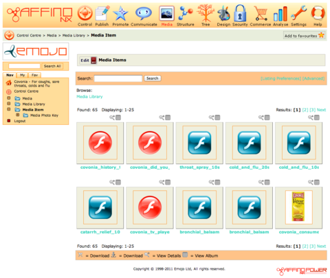
Click on the image above to get a better insight into the changes made, when compared to a year ago, every single element of the page has been either completely re-done or significantly improved. The screen cap below show how Affino used to look. It’s interesting to see that whilst everything has changed, the broad configuration has stayed the same.
Finger Friendly
Every user interface decision we make today factors in how tablet / finger friendly the page is going to be. All the underlying tech also has to be tablet friendly and elements such as contrast play a much bigger role in the decision making.
Persistent
A big focus for us is to keep the highest priority interface elements on the screen at all times. This is especially important in the era of swiping. It means elements such as the App Bar and Edit Bar will always be present within easy reach.
Task Focused
We are evaluating every screen in Affino to see if it does the best job of delivering the tools that a user needs to effectively manage the content / settings / profiles / users / import / export / everything. It means that previously generic screens have been greatly tuned with the new search bars, refined listing, dynamic look-ups, improved information display and much more. They just work.
More Automated
The biggest changes revolve around what you don’t see. We’re removed hundreds of confusing options; added wizards to reduce user confusion; automated many of the processes where previously users would have needed to actively manage.
More Polished
A lot of elements are now simply more polished, look better, do what you expect, even have better names so are easier to learn.
Related
How does the Control Centre enhance usability on mobile devices?What persistent elements improve user experience in Affino's interface?How are task-focused screens optimized for content management efficiency?What automation features reduce user confusion in the latest release?How have visual improvements contributed to the overall polish of Affino?
Did you find this content useful?
Thank you for your input
Thank you for your feedback


Upcoming and Former Events

Affino Innovation Briefing 2025

Webinar - Affino Elevation Update Demo

Webinar - Introducing Affino's Fourth Generation AI Services

Webinar - Enhanced Affino Commerce & Subscription Capabilities
Driving business at some of the world's most forward thinking companies


Our Chosen Charity
![]()
Meetings:
Google Meet and Zoom
Venue:
Soho House, Soho Works +
Registered Office:
55 Bathurst Mews
London, UK
W2 2SB
© Affino 2025