Brand Identity - Unique, Relevant, Meaningful, Memorable!

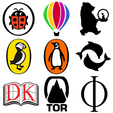
Here above is a collection of some of my favourite book publisher / imprint logos. Some of these have been nipped and tucked and evolved over the years - like the Ladybird Books logo, while others have been pretty much constant since their inception. I feel all the logos featured are great examples of how logos can really work for your business - both as a mark of quality, as well as a mark of category.
The first three idents - Ladybird | Usborne | Walker Books - are all Children’s Books Publishers, and each of the logos does a marvellous job of conveying who the intended target audience is. As I mentioned at the start, the Ladybird logo has changed the most - going from the semi-realistic illustration of my own childhood days to the current much more cartoonish form - which I believe is actually more suitable in any case. We kids had an enormous library of Ladybird Books when we were growing up.
In the next row we have Puffin | Penguin | Thames & Hudson. The first two are sister imprints - more closely parent and child - with the Puffin imprint aimed at Children, and Penguin for more mature reading. Thames and Hudson’s two dolphins represent Art Books - or more broadly, books on Art, Architecture, Design and Visual Culture.
In the third row - Dorling Kindersley | Tor | Phaidon - are all similarly typographical idents. I personally don’t usually like assimilating letters into the ident - for me the best logo idents usually are powerful stand-alone symbols - like the ones in the rows above. For these 3 it kind of works to have the letters included. When I see the DK logo it immediately brings to mind highly illustrated and picture-rich books and visual guides. Tor as a Science Fiction and Fantasy imprint has an ident which associates it more closely with the kind of craggy mountains of doom you find in the Fantasy genre - but it is a great ident for that. Finally, my favourite Art Book imprint simply uses the Greek letter Ф - being the first phonetic syllable in the name. When I see the Ф on a book spine, it immediately brings back warm memories of previous books from that publisher.
In all cases here, the symbol identities are genuinely working for and on behalf of their imprints - properly identifying their genre type to the potential customer, and signifying a mark of quality.
In the Internet Age where you now have billions of websites and digital properties, it is more important than ever to have a great logo which encourages positive feeling in your existing and potential customers. As an example, the Apple logo is now so strong that some of the Apple fans would pretty much buy anything which carried that brand mark. I get quite upset when I see brand marks and logos which fail to communicate or represent what they are about. A strong brand mark works for the brand or company it represents - helping to connect to consumers, and overcome obstacles to adoption / transaction.
Every single company benefits from having a well-defined and strong brand image - it is genuinely a wonder how and why so many don’t have decent logos / idents with which to represent themselves ...
Related
How do logos enhance brand identity for publishers?What elements make a logo memorable and meaningful?How can logos effectively target specific audiences in publishing?In what ways do logos signify quality in book publishing?How does a strong logo influence consumer perception and loyalty?
Did you find this content useful?
Thank you for your input
Thank you for your feedback
Upcoming and Former Events
Affino Innovation Briefing 2025
Webinar - Affino Elevation Update Demo
Webinar - Introducing Affino's Fourth Generation AI Services
Webinar - Enhanced Affino Commerce & Subscription Capabilities
Meetings:
Google Meet and Zoom
Venue:
Soho House, Soho Works +
Registered Office:
55 Bathurst Mews
London, UK
W2 2SB
© Affino 2025


