Connect with Us!
Latest Event

Latest Case Study

Latest Case Study
Discover Affino
Web Design in 2013 means Hamburgers, 960 Grids and Flexible, Responsive Frameworks
We’re in the process of completely re-designing this Comrz.com website, and are aiming to take advantage of every one of the latest website design innovations. With the inevitable move to mobile devices, these have now become the key interfaces, so the emphasis becomes increasingly how to make mobile sites adapt to desktops rather than vice versa, as used to be the case. Here below we detail some of the key methodologies which we will be adopting for Comrz.com and which will of course find their way into Affino 7 too...
1: Flexible, Responsive Frameworks
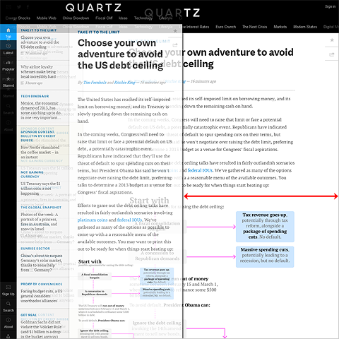
As can be seen on forward-thinking sites like Mashable.com and Qz.com - one website design really can fit all by shifting and adapting to accommodate different screen resolutions from desktop to laptop to tablet and mobile.
2: ’Hamburger’ Menu Panels
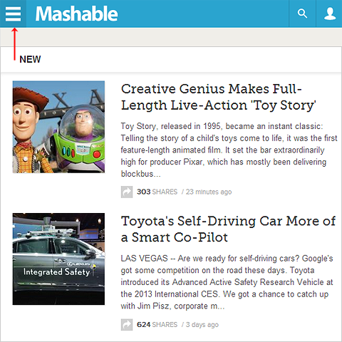
In times past, most Affino sites used to utilise 3 column designs for main content listing pages - with responsive design, it seems to be that 2 columns is now the norm - and when the screen decreases to such a size that only a single column can be accommodated, then the ’Hamburger’ icon appears top left to pop-over the second column as required (e.g. Mashable). Lots of iPhone apps already have this, as does the Affino mobile interface. We are currently evolving an Affino methodology where you identify primary and secondary columns, the latter of which is accessed via Hamburger-activated panel when screen / window size shrinks beyond minimum dimensions.
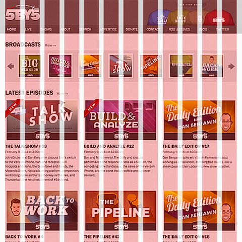
3: Floating / Sticky Menus
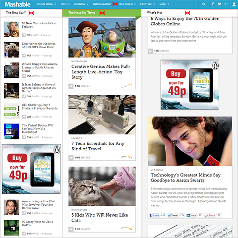
We already have this in Affino to a large degree, but will be evolving it to include menu headings much like you find on Mashable.com
4: Flat Design
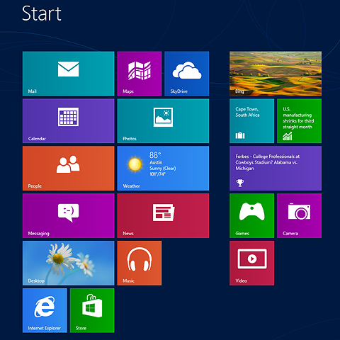
As exemplified by Microsoft’s Windows 8 / Modern Interface - flat panels of colour are infinitely scaleable and flexible - where more complex and textured designs cannot easily adapt to different formats.
5: Pinterest-style Floating Panels
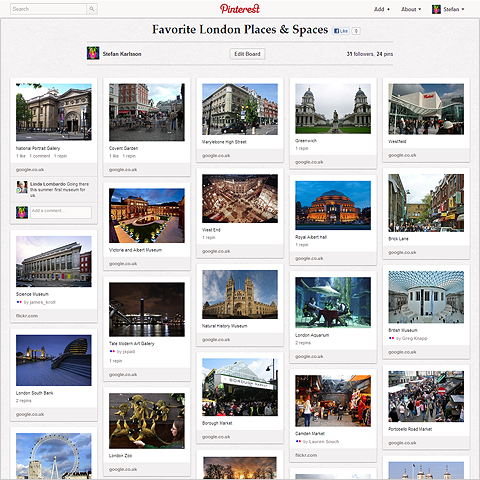
the New MySpace website owes quite a bit to Pinterest, and there are many more recent sites which borrow aspects of Pinterest’s adpative layout - in terms of infinitely scaling and variable rows of semi-fixed format interactive panels
6: 960 Grid System
A methodology that has been in use for a while, but has only recently been adapted for fully responsive frameworks. The 960 Grid System consists of structuring your website framework over a grid of either 16 or 12 columns. Each content / design element is allocated to a pattern of columns so that content can scale up and down dependent on viewer screen resolution.
7: Tablet-style Navigation
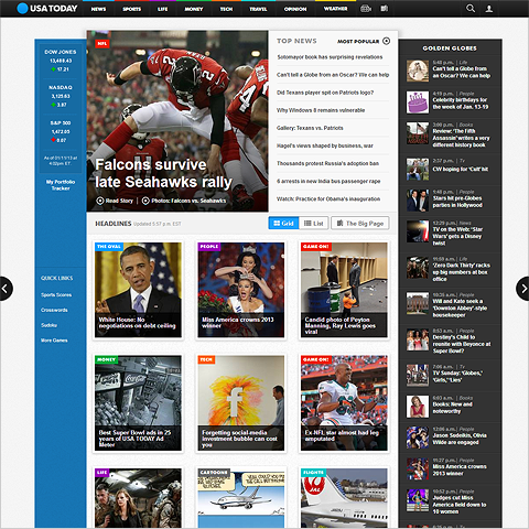
Tablets and mobile devices consist in effect of a 2-axis navigation where you sweep up and down, and left and right. The main USAToday.com website utilises this methodology in the form of 2 arrow side-bars which enable you to page through Site Channels / Sections defined in the top menu hierarchy - much like you do on the Daily Mail etc. mobile apps.
8: Use of Larger Fonts
Designers have historically preferred smaller fonts for neatness, but the current mobile-centric trend sees fonts ranging upwards - like on Trent Walton’s site.
9: Enlarged Search Input / Overlay
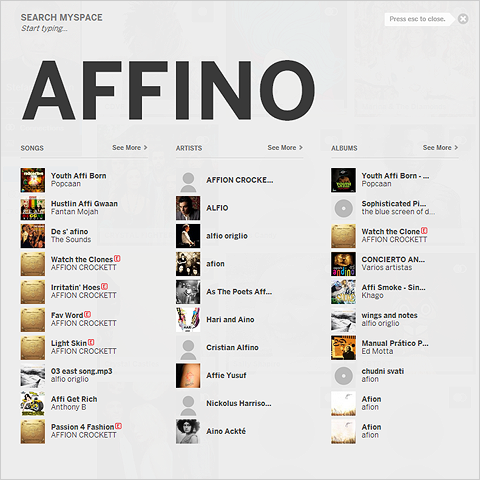
One of the really cool things about the New MySpace site is how an overlay panel appears with enlarged Search text immediately as you start typing on any screen of the site. This is very much an extension of Affino’s existing Instant Search, but definitely something we will be utilising on the new Comrz.com site.
10: Universal Connectors
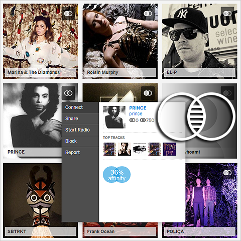
Another brilliant innovation of New MySpace is the Universal Connector icon (A sort of symbolic Venn Diagram) which appears on every panel and allows you to universally connect to every part of the MySpace site - whether Person / Artist, Album or Song. This is a little more clever than Facebook’s Like or Google’s +, and is definitely something we will be incorporating into Affino - allowing site users to fully connect to each other and whatever content or media is presented on the site.

Did you find this content useful?
Thank you for your input
Thank you for your feedback


Upcoming and Former Events
PPA Independent Publisher Conference and Awards 2023

Affino Innovation Briefing 2023

Press Gazette Future of Media Technology Conference 2023

PPA Awards 2023
Driving business at some of the world's most forward thinking companies


Our Chosen Charity
Meetings:
Skype and Zoom
Registered Office:
55 Bathurst Mews
London, UK
W2 2SB
© Affino 2024