The Science of Brand Colours
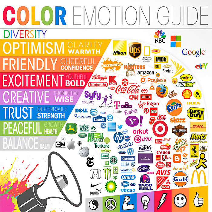
[Color Emotion Guide adapted from KISSmetrics]
How your colour choices influence and shape consumer behaviour...
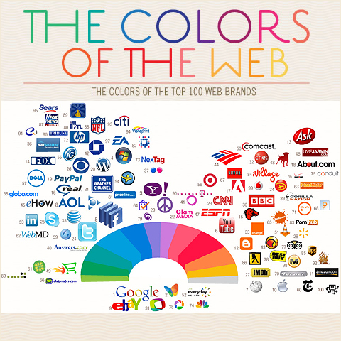
In branding, the two most popular / well known colours are ’Corporate Blue’ and ’Fire Engine Red’. Just think of Facebook, Twitter and LinkedIn on one side, and YouTube, Adobe and CNET on the other - all tech brands with well-known websites. In my ’Colours of the Web’ article you can see just how dominant blue and red are, although their online / offline applications tend to be quite different. Whilst Red is seen as a very strong packaging colour, particularly for food, too much red online will cause migraines. Blue however works pretty well offline and online, although it comes with its own provisos.
The earliest iterations of the Affino Control Centre (our Social Commerce system Back End) were in the blue pallet, a reassuring and technical colour, but one that tends to make interfaces cold and uninvolving - even intimidating. After much client feedback, and branding consideration, we moved to a ’Friendly Orange’ pallet, which was warmer and more welcoming to the user, although its side-effects were that Affino looked less technical and powerful as a result.
In fact most desktop apps - say Photoshop for instance, tend to be in a neutral grey pallet. This grey is not as cold as blue, but sill conveys technical proficiency. Many interfaces adopt a warmer hue of grey to make the interface friendlier still. The downside of Grey / Warm Grey is that it all kind of fades into the background - giving you zero brand recall. It’s fine for bigger, more established brands to go grey, but smaller, up-and-coming brands really need to do something to spark interest, recognition and traction. For this reason, the latest iteration of Affino (Affino 7) has a colour pallet of a fairly distinctive blue-grey.
The current iteration of the Comrz.com website features a Lime Green pallet with accents of fluorescent green. Our original frame of reference here was ’Castrol - Liquid Engineering’. We wanted Comrz to look distinctive and have strong technical / engineering connotations. However, the current trend is now for more muted tones - more subtlety and elegance. For the forthcoming Comrz site, the pallet has been changed quite significantly, veering closer to a dark army green. The technical connotations will hopefully be retained, this time with an added ingredient of ’military grade’ appeak on top.
The infographic at the top of this page reveals some of the key colour connotations and associated brands, but there are yet further colour associations that need to be considered. In some cultures, Black is the colour of death / mourning, for others it is white, and other sitll - a deep purple. When we assign a colour pallet to our brand, we really neeed to consider what connotations come with each colour, and how suitable those are in defining and underlining representative brand values / brand messages.
As per above:
MULTI-COLOURED - [Google etc] - signifies diversity, inclusiveness, rainbow flag has gay connotations, also has hints of ’basic’ and ’childsplay’ in the visual metphor of children’s building / alphabet blocks
YELLOW - [The AA, Yellow Pages etc.] - signifies clarity and warmth, also - joy, happiness, betrayal, optimism, idealism, imagination, hope, sunshine, summer, gold, philosophy, dishonesty, cowardice, jealousy, covetousness, deceit, illness, hazard, friendship, disease
ORANGE - [easyJet etc.] - signfies friendliness, cheerfulness and confidence, also - energy, balance, enthusiasm, warmth, vibrancy, expansiveness, flamboyance, demanding of attention
RED - [Coca-Cola etc.] - signifies excitement, youthfulness, boldness, also - energy, passion, love, desire, speed, strength, power, heat, aggression, danger, fire, blood, war, stop sign, alarm, violence, intensity, decoy, showiness, penalty
PURPLE - [Yahoo etc. (note some brands listed actually pertain to pink!] - signifies creativity, imagination, wisdom, also - royalty, nobility, spirituality, ceremony, mysteriousness, transformation, enlightenment, science, cruelty, arrogance, mourning
BLUE - [Facebook etc.] - signifies trust, dependability, strenght, also - peace, tranquility, cold, calm, stability, harmony, unity, truth, confidence, conservatism, security, cleanliness, order, loyalty, sky, water, technology, depression, appetite suppressant
GREEN - [BP, Specsavers etc.] - signifies peace, growth, health, also - nature, environment, good luck, renewal, youth, spring, generosity, fertility, jealousy, inexperience, envy, misfortune, vigor
GREY - [Apple etc.] - signifies balance, neutrality, calm, also - security, reliability, intelligence, seriousness, modesty, dignity, maturity, solidity, conservativeness, practicality, old age, sadness, apathy, pallor, ill-health
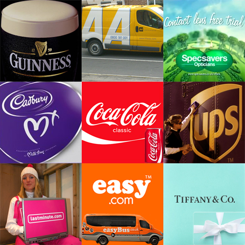
A few years ago I did an article on ’The Colour of Brand Identity’ where I featured 9 brands which have become synonymous with a particular colour - Guinness, The AA, Specsavers, Cadburys, Coca-Cola, UPS, LastMinute.com, Easy.con and Tiffany’s. Four of these are not covered by the top colour wheel, so I will add notes here:
BLACK - [Guinness] - signifies power, sexuality, sophistication, formality, elegance, wealth, mystery, fear, evil, unhappiness, depth, style, evil, sadness, remorse, anger, anonymity, underground, good technical color, mourning, death (Western cultures)
WHITE - [No default white logos really, but much used in packaging] - signifies reverence, purity, birth, simplicity, cleanliness, peace, humility, precision, innocence, youth, winter, snow, good, sterility, marriage (Western cultures), death (Eastern cultures), cold, frost, heat, light, clinical
BROWN - [UPS] - signifies earth, stability, hearth, home, outdoors, reliability, comfort, endurance, simplicity, comfort, dirt
PINK - [LastMinute.com] - signifies love and romance, caring, tenderness, acceptance, calm, babies, barbie dolls, girliness, cheapness, has gay connotations in several cultures
TURQUOISE - [Tiffany] - signifies calm, coolness, sophistication, water, elegance, wealth; lighter turquoise has a feminine appeal
The key criteria with deciding on a brand colour is to stand out, without alienating your target audience. For many logos / brands there was no rhyme or reason behind them, the colour is often a personal preference by the brand owner (e.g. Mark Zuckerberg | Facebook). However, there really is a science for discerning exactly who your target audience is, and which visual cues add appeal, and which repel. Consumers are exposed to so much branding these days, that it really is important to stand out for the right reasons. Colour is certainly one of the key influencers - and can determine whether something has the correct memorable appeal. The right colour will add impact and appeal, as well as value. A classic example of this is the two Sunglasses brands - Luxottica and Safilo, which between them manufacture circa 90% of all designer frames; the vast majority from common materials; yet the difference between cheapest and most expensive is close to 1000% - such is the power of strong branding. Some brands work for diffusion; e.g. Armani Colezzione, Emporio Armani, Armani Jeans and Armani exchange, whilst others cannot be so easily diffused, which is why Toyota had to create the Lexus brand to sell luxury cars, as Toyota itself is synonomous with value.
It is important to remember that colour is just one of the principal cues, as brand values can be further strengthened and refined by complementary fonts, idents and positioning statements / straplines.

Did you find this content useful?
Thank you for your input
Thank you for your feedback
Upcoming and Former Events
PPA Independent Publisher Conference and Awards 2023
Affino Innovation Briefing 2023
Press Gazette Future of Media Technology Conference 2023
PPA Awards 2023
Meetings:
Skype and Zoom
Registered Office:
55 Bathurst Mews
London, UK
W2 2SB
© Affino 2024
